Rista Hospitality Website
A hospitality website presentation designed as one responsive experience across desktop, tablet and mobile.
 01 / MULTIVERS CREATION
FROM BRIEF
TO FINAL
IMPACT.
THE ASK.
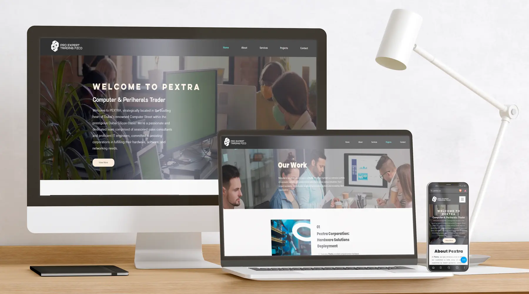
Present Rista Hospitality as one responsive website experience across desktop, tablet and mobile. The portfolio visual brings those three formats together so the layout can be compared across screen sizes.
THE FRICTION.
Hospitality websites need room for imagery and a clear reading order. The design challenge is to preserve that balance as the available width changes from a desktop screen to a phone.
THE IDEA.
The presented interface carries a shared visual language through the three device layouts. Content blocks and imagery adapt to each frame while maintaining a recognisable hierarchy.
THE RESULT.
A responsive website design presentation showing desktop, tablet and mobile applications.
EVERY FORMAT.
ONE STORY.
The project image shows the website across three device formats. The detail views below are crops of that same presentation, bringing the layout and interface hierarchy closer.
WHAT WE
CREATED.
- 01Hospitality website interface
- 02Desktop layout presentation
- 03Tablet and mobile adaptations
- 04Cross-device design showcase
HOW THE
PROJECT
CAME TO LIFE.
Structure
Establish the order of information and the role of imagery in the hospitality presentation.
Compose
Set a clear hierarchy for the main interface and supporting content.
Adapt
Carry the same visual language into tablet and mobile layouts.
Present
Show the device layouts together for a direct comparison of the responsive direction.